
Daniel Smith is well loved by many artists around the world, including myself, so when I first heard that they were releasing half pan sets, I knew I had to get them for myself.
The question is… are they worth it?
Let’s take a look at the Ultimate Mixing Set.
The Ultimate Mixing Set by Daniel Smith includes a travel case with 15 colors selected by artist and blogger Jane Blundell plus one bonus travel case with 15 empty pans.
Jane Blundell is a watercolor artist living in Australia. In addition to numerous workshops and demos, Jane is known for her many experiments and explorations with color on her blog. Jane created the Ultimate Mixing Set because she is often asked what colors she recommends for people to buy to get started in watercolor.
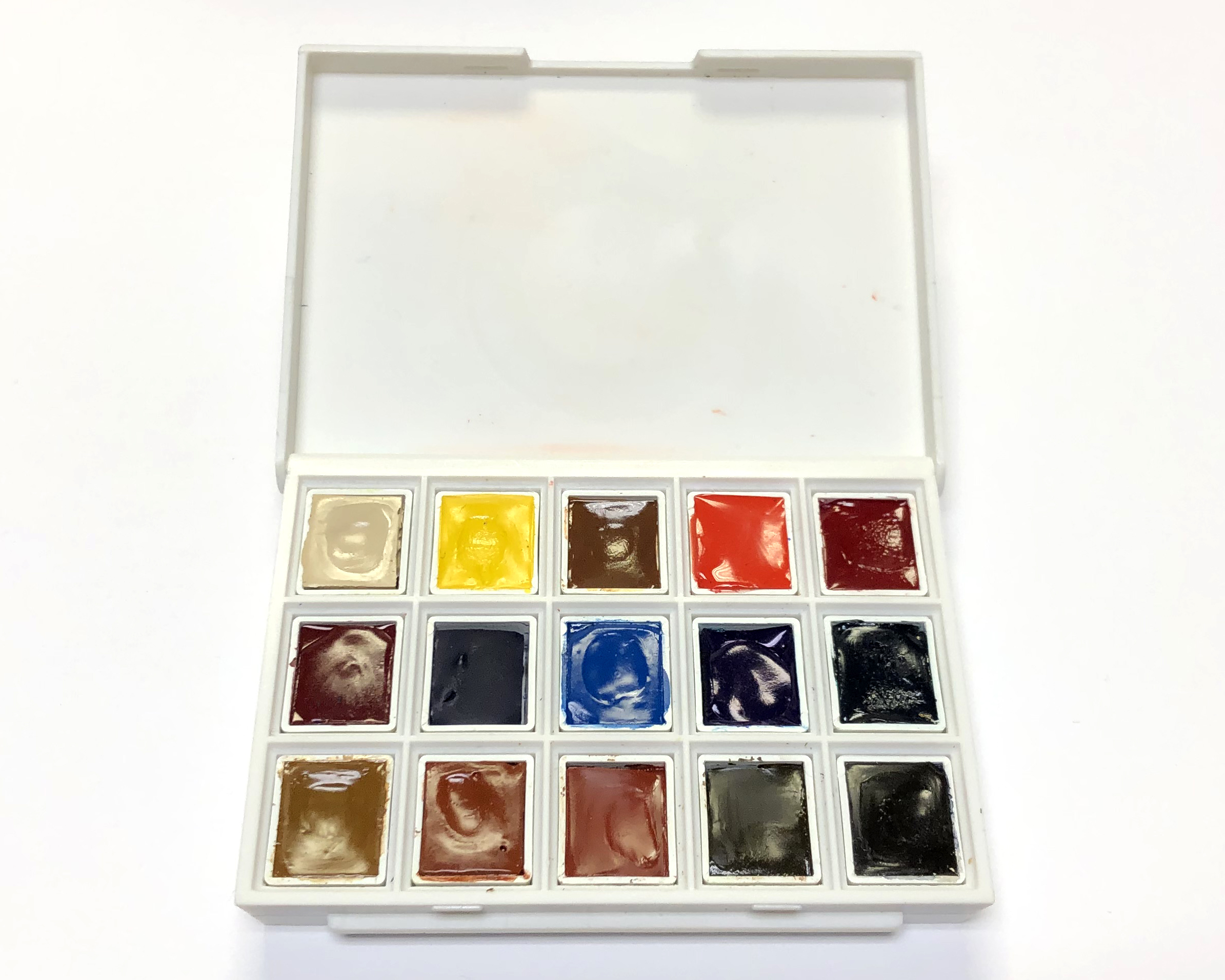
The set consists of 12 single pigment colors and 3 convenience mixtures.
Buff Titanium (PW 6:1) is a semi-opaque to opaque light beige or ecru shade. This color is well-suited for mixing to lighten and desaturate other hues, creating pastel colors and rendering sandstone and sandy beaches.
Hansa Yellow Medium (PY 97) is a semi-transparent, low-staining, bright, neutral yellow color (neither warm nor cool) with a high tinting strength. It is a good general purpose yellow paint and is very frequently used in convenience green mixtures.
Quinacridone Gold (PO 48, PY 150) is a transparent, low-staining golden yellow hue with granulating properties. According to Jane, you can create a very close hue by mixing Hansa Yellow Medium with Burnt Sienna.
Pyrrol Scarlet (PR 255) is a semi-transparent to semi-opaque, heavily staining, moderately dark-valued, very intense fire engine red shade. It is similar in color to Cadmium Red, Permanent Red, and Perylene Red, but Pyrrol Scarlet looks cleaner, less granular, and disperses more evenly.
Permanent Alizarin Crimson is a vibrant, transparent, cool wine-red color with medium staining properties. It is a three pigment mix of PR 177 (Anthraquinone Red), PV 19 (Quinacridone Rose), and PR 149 (Perylene Scarlet).
Quinacridone Rose (PV 19) is an extremely transparent, vivid red-violet hue that is beautiful on its own or mixed with blues to create beautiful purples. When mixed with Ultramarine Blue, it produces a rich, clear, warm purple shade. When mixed with Phthalo Blue (Green Shade), it creates a deep dusty purple hue.
Ultramarine Blue (PB 29) is a very transparent, warm blue shade with medium staining and granulating properties. It mixes well with cool reds such as Quinacridone Rose or Permanent Alizarin Crimson to produce clean, bright purples.
Cerulean Blue Chromium (PB 36) is a lovely semi-transparent, muted blue color that is low-staining and granulating. It is often used to render skies with subtly textured pale blue washes.
Phthalo Blue (Green Shade) or PB 15:3 is a super staining, super transparent, very dark-valued, intense cool blue hue with high tinting strength and good saturation. Mix it with Hansa Yellow Medium for rich, bold greens.
Phthalo Green (Blue Shade) or PG 7 is a heavily staining, extremely transparent, dark-valued bluish-green shade. When mixed with a warm yellow like Quinacridone Gold, it produces bright natural greens. When mixed with a red like Permanent Alizarin Crimson, it creates a moderately dark-valued gray or black.
Goethite (Brown Ochre) or PY 43 is a rich, warm tan color that is semi-transparent, low-staining, and granulating. Unique to Daniel Smith, it was named after Johann Wolfgang von Goethe, the German writer and mineralogist.
Burnt Sienna (PBr 7) is a transparent to semi-transparent, granulating, dark-valued, moderately dull, warm, earthy orange-brown hue. This is one of the most versatile and useful paints, which is why it’s a traditional palette staple for many artists.
Indian Red (PR 101) is an opaque, reddish earth-brown shade with medium staining and granulating properties. It mixes well with Goethite and Cerulean Blue Chromium.
Raw Umber (PBr 7) is a semi-transparent, low-staining, granulating, rich, dark brown color with medium tinting strength. This cool deep brown color is great for shadow areas on a figure or in a landscape.
Jane’s Gray (PB 29, PBr 7) is a convenience color, created by mixing Ultramarine Blue (PB 29) and Burnt Sienna (PBr 7). It is a semi-transparent, low-staining, granulating, neutral gray hue.

PRODUCT:
Daniel Smith uses the exact same formula for both tube and pan colors, so you can expect the same professional artists quality—clarity, vibrancy, and permanence.
All of the paints selected for this set have an ASTM lightfast rating of I (Excellent Lightfastness), meaning you don’t have to worry about your paintings fading or changing when exposed to light.
The paints re-wet quickly, mix beautifully, and they are an absolute joy to work with.
VALUE:
Of course, tubes will always be more economical, but this is a great way to try more colors from Daniel Smith without investing in a lot of tubes.
At $74.49, each half pan is costing $4.97, which is not bad in comparison to other brands. (I bought this at $59.59 from Blick Art Materials during a sale.)
To put this in perspective, a set of 14 half pans from Winsor & Newton’s Compact Set costs around $69-78. Schmincke Horadam Aquarell’s Half Pan Set of 8 costs around $73-99. Holbein’s Palm Box Set of 12 Half Pans normally costs around $109-126.
That said, the brands I mentioned above include either a metal tin box or a durable plastic case, which we will cover shortly.
The paints are hand-poured, meaning you might expect the half pans to be filled to different levels. This doesn’t bother me personally, but I think it’s worth mentioning.
PACKAGING:
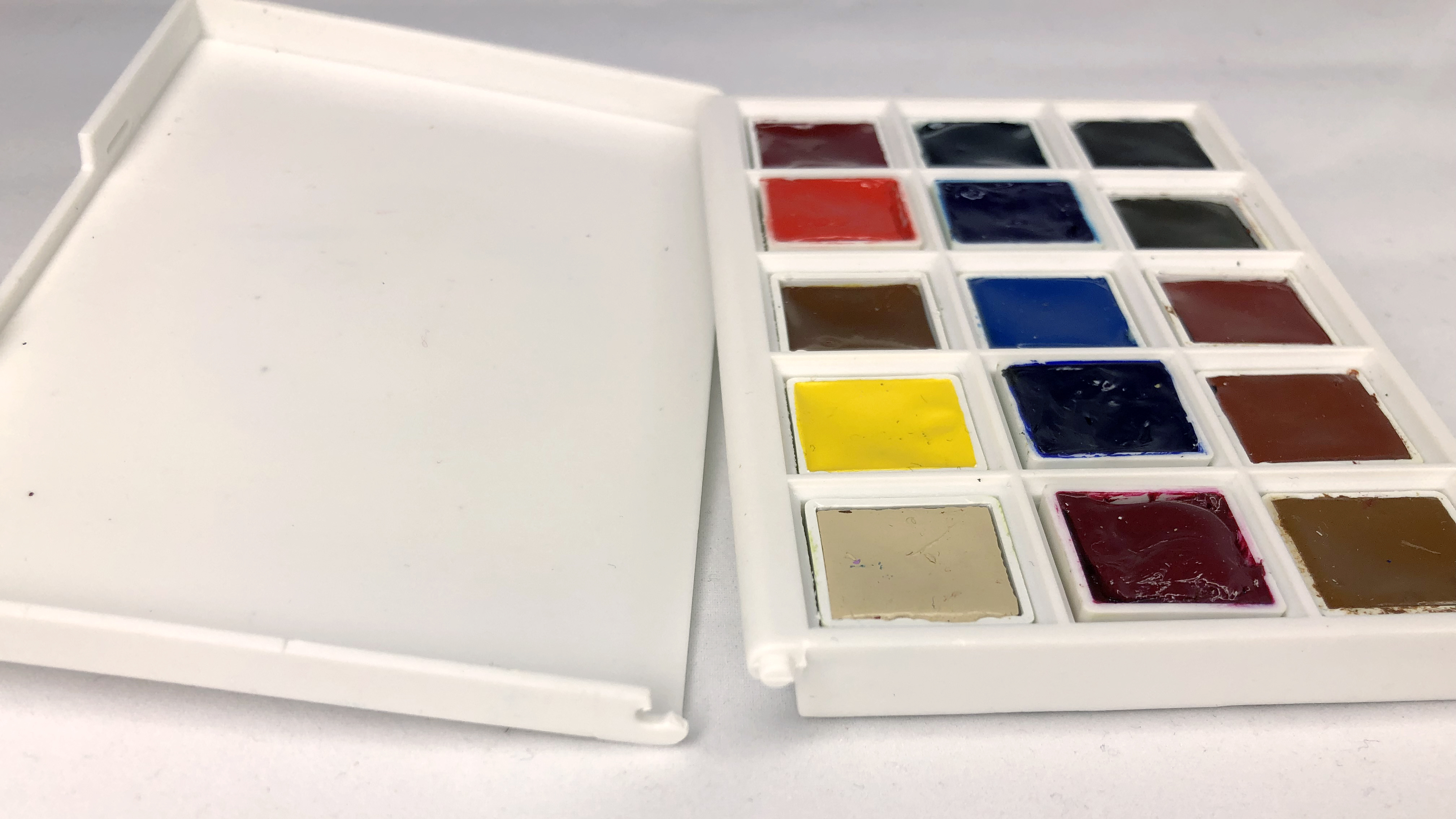
The travel case is lightweight, compact, and will fit nicely in your pocket, but it’s not well designed.
The travel case is not easy to open. The lid doesn’t open flat, and there is no lip in the back of the mixing area, so if you try to mix in the cover, the paints will run down and mix together or run out of the lid.
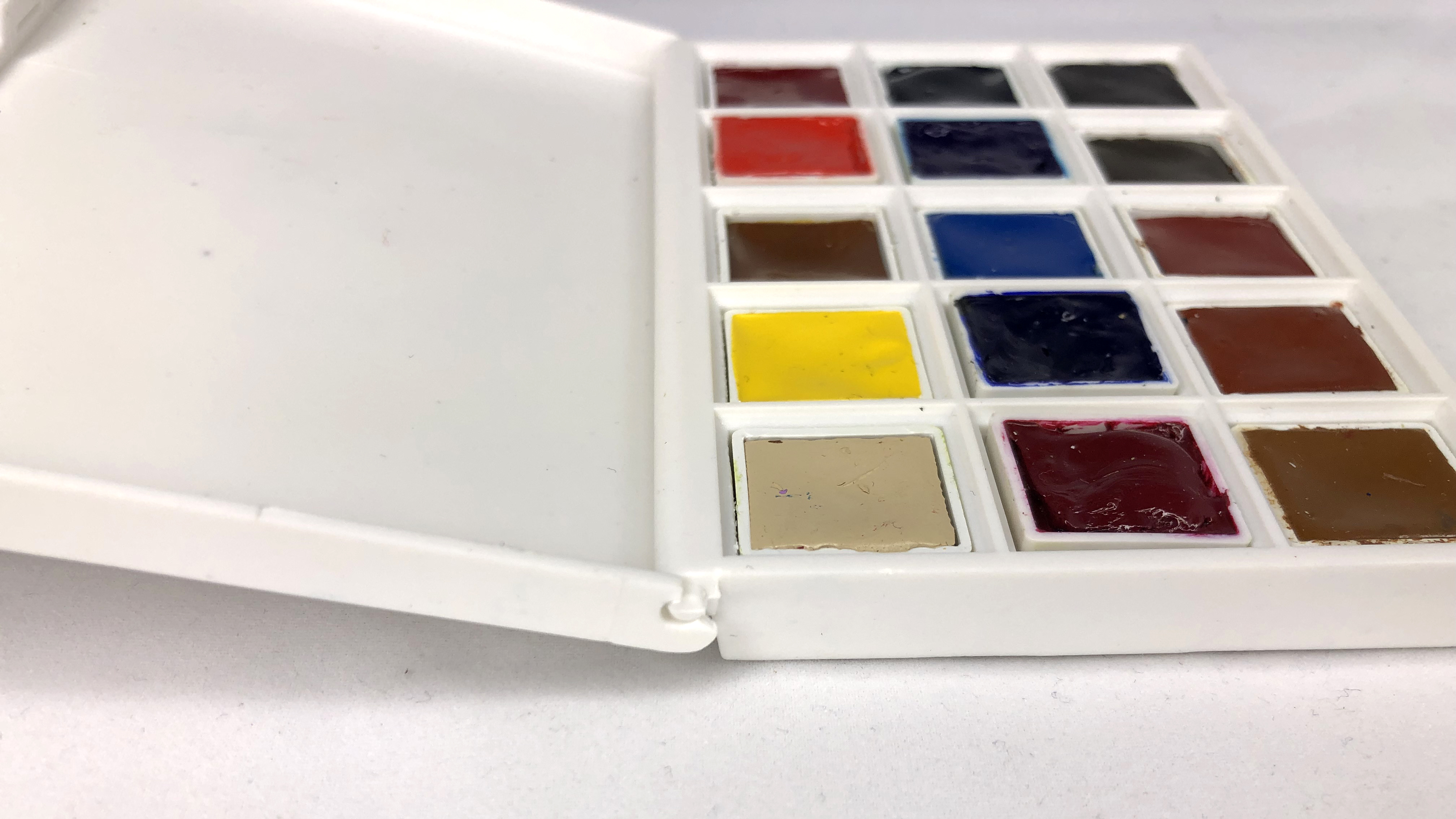
The case doesn’t hold the half pans very well. If you turn it over or tip it, some of the pans will fall out.
Some of the paints fall out of their pans, but this is an easy fix. I just put a drop of glycerine in the pan and put the paint back. That should help the paint stick to the pan better.
The material feels cheap and flimsy. One of the hinges actually snapped off when I opened it.
There is a color chart included with the set that gives you the names of each pan. However, the half pans are not labeled, which could be a problem if they fall out, so the first thing I did was label the pans. That way, if I run out or need to know the colors, I can easily identify them.
OVERALL:
I have no complaints with Daniel Smith watercolors as they are top notch, but the travel case is of poor quality and design.
Would I still recommend this set? Yes. I think this is a wonderful set if you want to try a variety of colors without having to pay a higher price for all the tubes. However, if you want to use this on the go, I would suggest transferring the pans into another container. You can buy an empty metal tin watercolor palette box from Amazon for around $8.99-13.99. That’s what I did. 😉

Leave a reply to Review: Daniel Smith Blues (Serene to Dramatic) Watercolor Half Pan Set – Jen de Leon Art Cancel reply